Laureate: Hideyuki Nakayama, LIST
Occasionally white, definitely not a cube
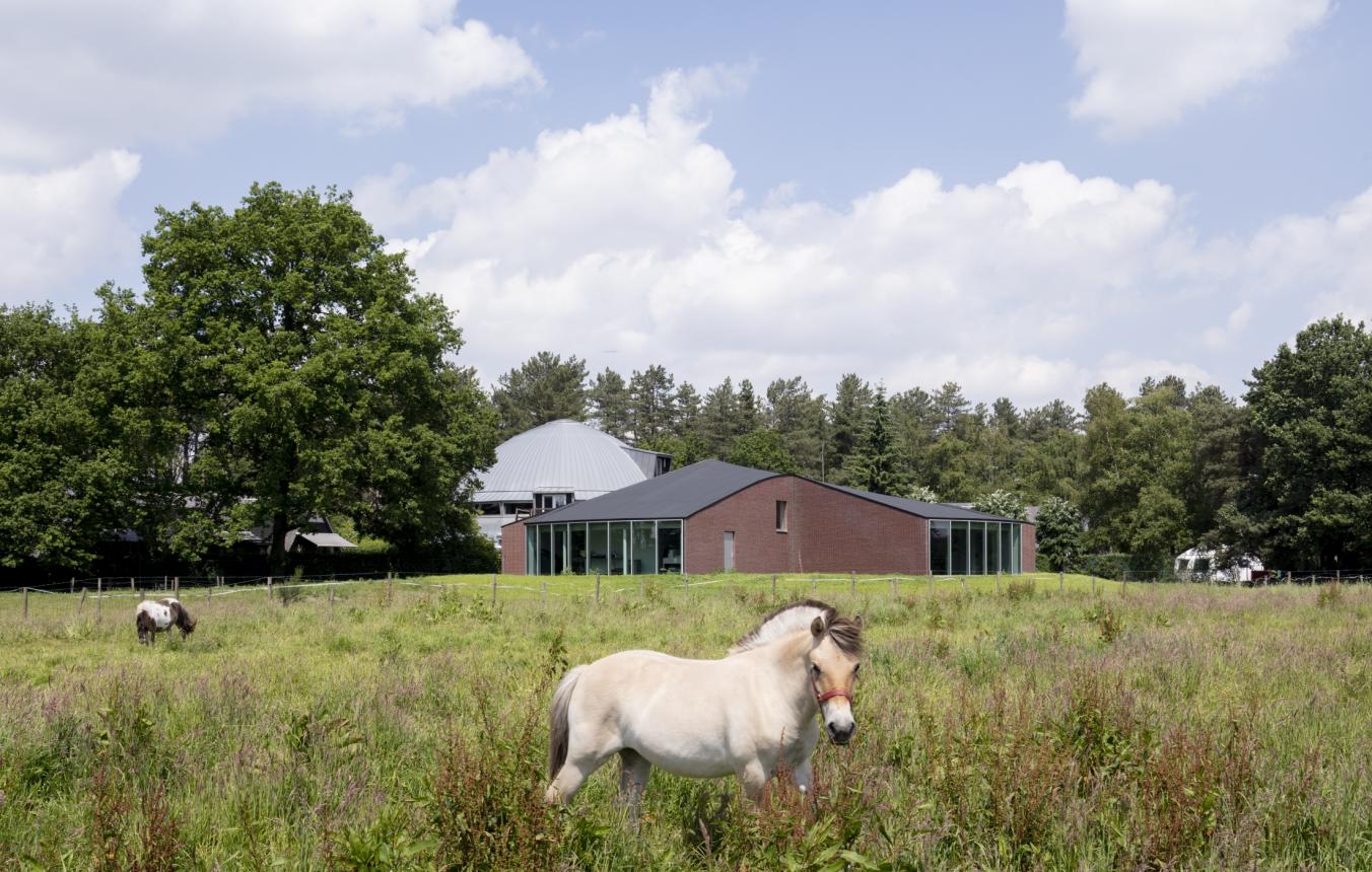
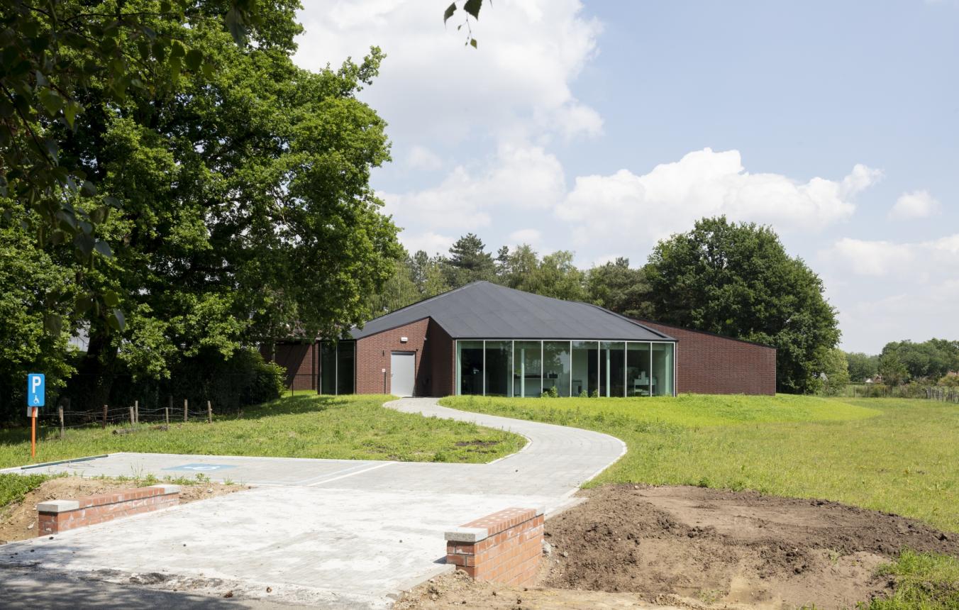
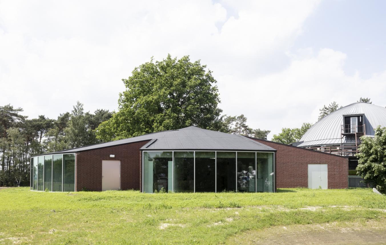
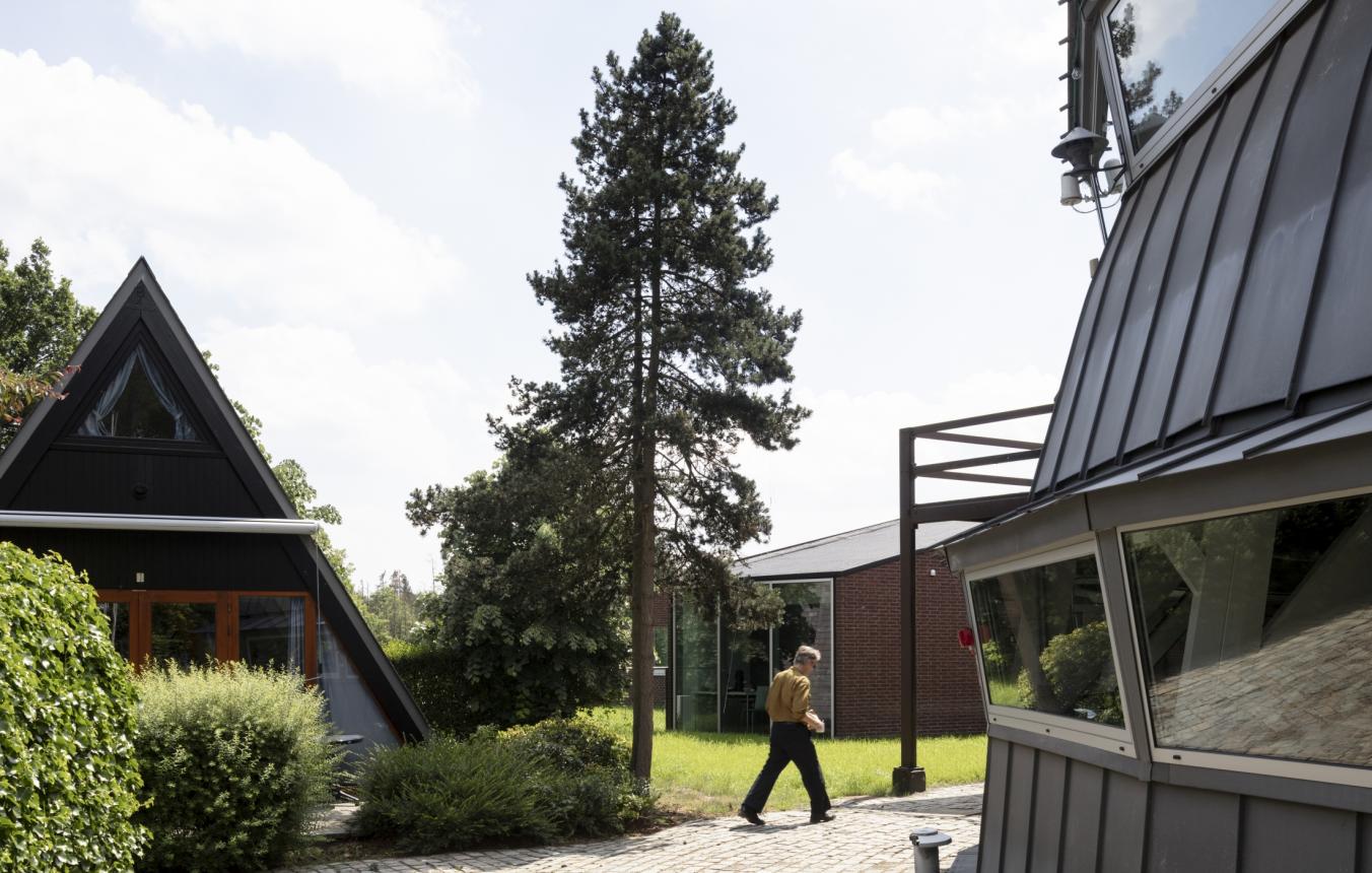
When we started to work on the extension of the Frans Masereel Centrum, it felt like an architecture school exercise. The relationship between platonic volumes and the open landscape suggested some kind of fundamental act of architecture, profoundly anchored within the discipline. The dome, the A-Frame houses and the two small ellipsoidal domes formed together a village, inhabited by what seemed to be a strangely urban tribe, surrounded by ponies, open fields and pine woods. Adding a new pavilion to Lou Jansen’s dome required us to be both attentive to its architectural qualities and to be prospective about its potential. The new building is neither an ode nor a critique of the existing centre. Above all, it tries to find rich and complementary interrelations with the existing environment and to charge the space, in and around it, with new possibilities.
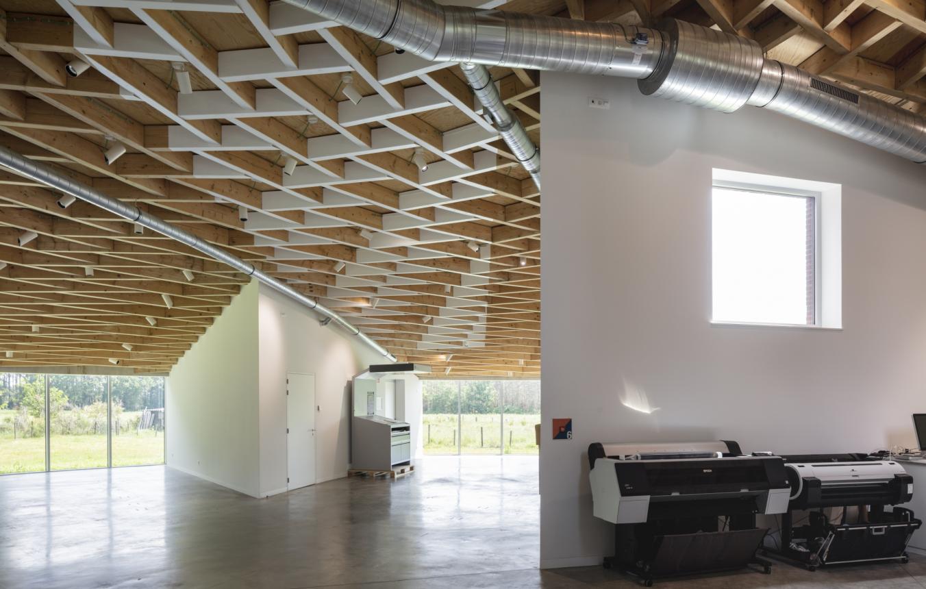
Within this context, particularly charged both in terms of form and landscape, we felt that there was the necessity to go beyond the white cube paradigm – an architectural standard that was celebrated throughout the last century as the ideal art space. Of course, there is a need for neutrality, to leave the front stage for art and make architecture vanish. Yet, should neutrality necessarily produce boring spaces? Shouldn’t architecture stimulate a state of receptiveness, creativity and quiétude without compromising spatial quality? All along the design process we felt an important engagement with these questions, imagining that Art and Architecture can interact differently particularly within the walls of the Masereel Centrum. As an art space, FMC is not really a gallery, nor a typical atelier. It looks like a small factory with its cast-iron machinery, pressure washers and ventilation pipes: a place of creative production and strange things, a place that produces sound, colours, and mess. All this paraphernalia is staged and shown as part of the experience, unlike a somewhat pedantic art gallery on an urban street corner.
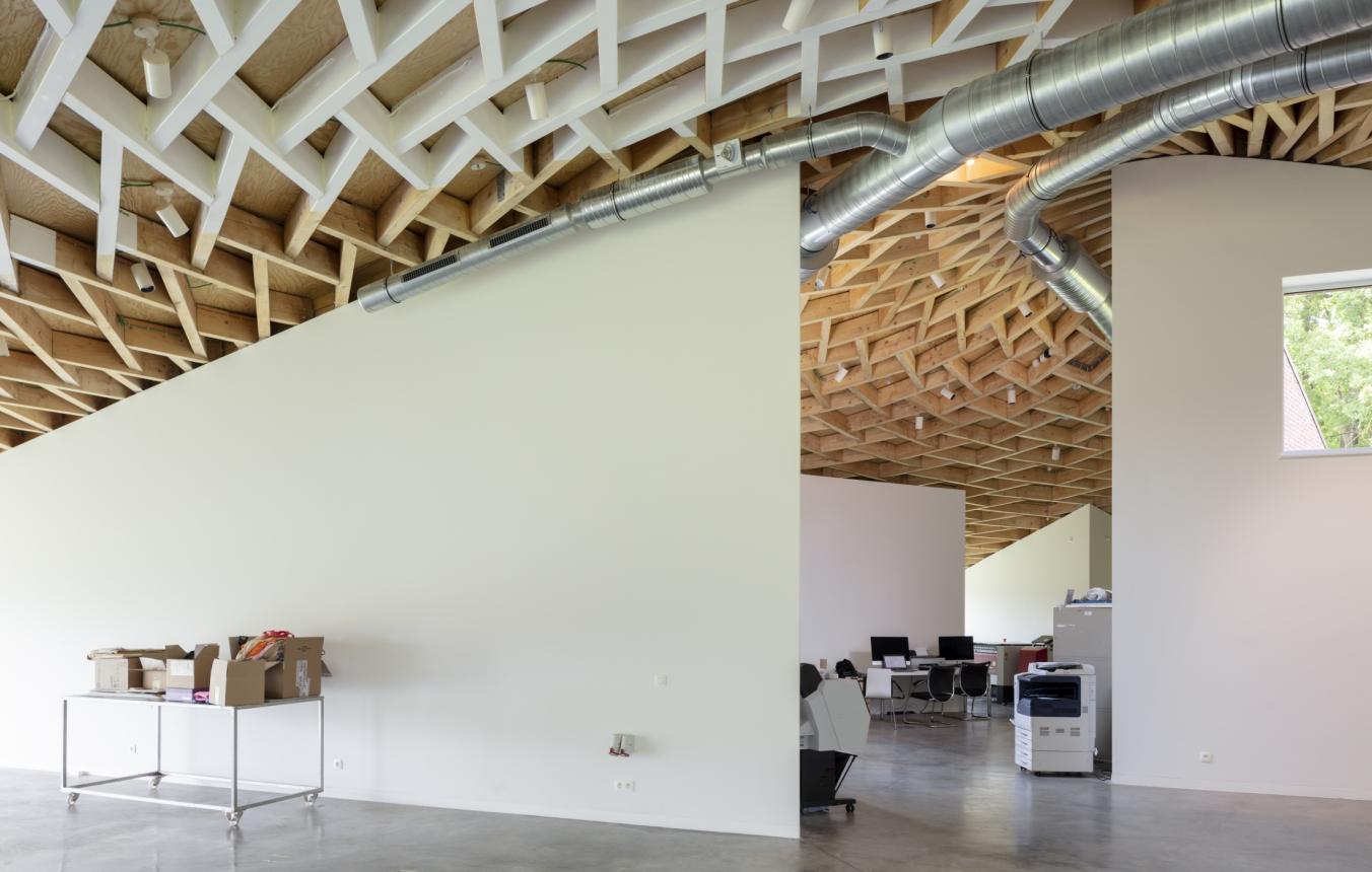
In geometrical terms the starting point of the new building is a circle, just like the dome but slightly larger. This circle generates both a vertical glass cylinder with a conical domed roof on the top of it. Pieces are cut out of the cylinder and cone assembly, like a cake, dividing it into spaces with sharply angled corners in between them. This layout leads to non-hierarchal relations: the spaces are both scattered and connected. The new pavilion does not enclose the different programmes and their relationships within a pre-determined scheme but offers a multitude of possibilities. This allows a unique spacial experience both from the artists’ and the visitors’ point of view. There is no clear limit between the exhibition space and the work space, but a series of junctions between the two. Visitors and artists bypass each other without trespassing the one or the other. Visitors are encouraged to make their way and to fix their own limits, according to their level of curiosity.
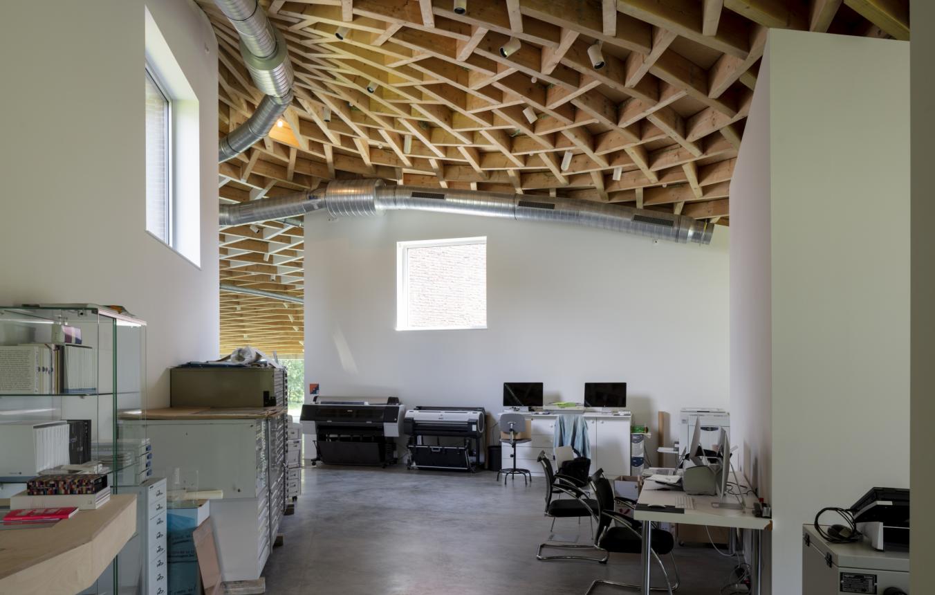
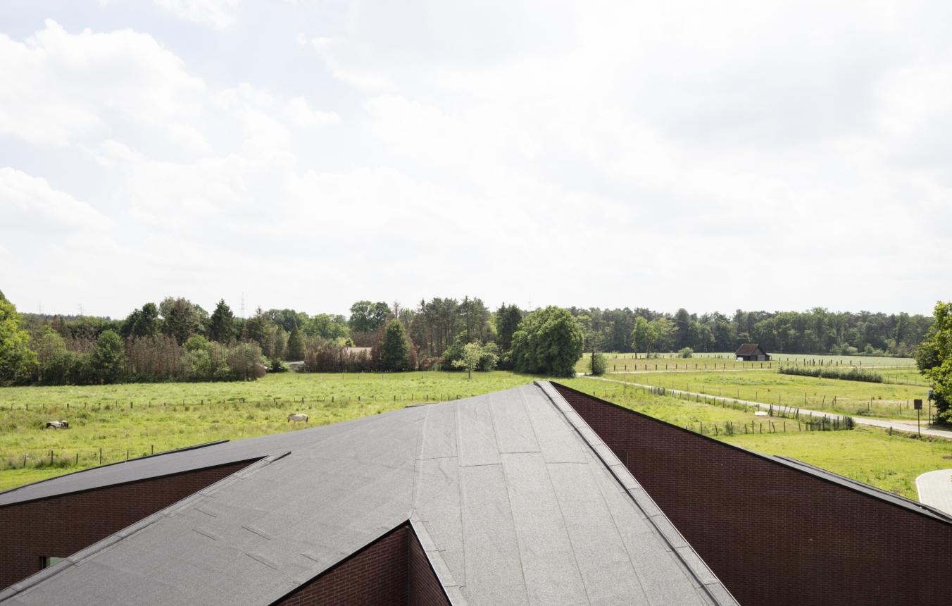
One may notice that the cake was cut in a somewhat awkward and irregular way. This clumsiness is due to the conviction that in order to reach a certain degree of neutrality, the design should follow a rather strict protocol, but also should have a certain liberty in its geometry and in the way the pieces are cut . The particular neutrality that we were looking for seems to be set somewhere between a strong form and a weak form, between an asterisk and a starfish. When a cone is cut radially, the section produced is straight. However as the section differs from the apex, the more curved it becomes. When working on the design, we noticed how beautiful these non-preconceived curves could be: commencing by being relatively straight at the circumference, they gradually curve as they brush past the apex of the cone. The long curved walls were not drawn or designed, they simply resulted from our design protocol, which aimed at avoiding a panopticon. Whilst the heart of the pavilion stimulates encounters, its periphery enhances individual experience. Everyone sees the centre, but hardly beyond this.
A cone is a simple shape, but is quite difficult to construct structurally. The most obvious solution for the roof structure might have been to draw radial beams from the apex to the circumference. However, this would have established a pronounced structural hierarchy based upon large section beams. This was exactly what we wanted to avoid, in order to keep the spaces free of hierarchy. Thus, we chose to use the renaissance principle of reciprocal beams. The roof structure is composed of 762 solid wood beams of equal section. 25 levels of reciprocity are arranged to cover the surface of the 29m diameter cone. Each piece is unique and influences all the others. The apex is slightly shifted from the centre of the circular base, producing a slight contrapposto.
The suspended texture of the roof interacts permanently with the floor plan. As for the motif of the structure, we tried to modestly follow a path somewhere between the cupolas designed by Philibert de l’Orme and by Nervi, with their ascendent interlacing lines, and Mies van der Rohe’s Neue Nationalgalerie with its square grid. Unlike other cupolas, the lines are not continuous from the apex to the periphery. The motif is based on a pattern which is repeated, but slightly transformed on each level. As a result, the structure is composed of small fragments which affirms its importance as a homogeneous and a visible architectural element. The roof does not compete with the art pieces. It floats above them like a neutral cloud. It diffuses a kind of grey quality, aiming to stimulate a state of receptiveness, essential both for working and for contemplating.
Kasterlee OO2606
All-inclusive design assignment for a printmaking studio and public area (also for exhibitions).

